Tests and positivity rates
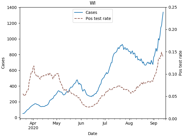
21 Sep 2020The Covid positivity rate in Wisconsin is now higher than it’s ever been. We are averaging 1800 cases a day, but with tests per day stuck at 10,000 or so. We know cases are high largely because of college campus outbreaks, but why is our testing so low?
The answer is that the number of tests being performed is not actually that low; in the past week it has actually sometimes approached 30,000 tests in a day. But in the way that Wisconsin reports the data, the headline is not actually the total numbers of positive and negative tests, but instead the number of new individuals testing positive and negative. Repeat test results, whether positive or negative, are not counted. So number of tests does continue to rise in the state, but since more and more people have already been tested at least once, the number of new people being tested is significantly lower.
I think this reporting convention is justifiable (a point I’ll return to below), but it’s important to understand if you’re looking at the data in detail.
The data in detail
Beyond their headline numbers, the DHS does share data for both people tested and total tests. The next two plots are copied from the Wisconsin DHS Covid website.
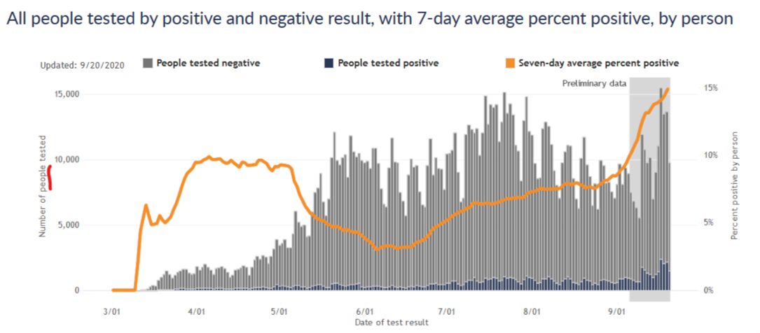
The first plot is for number of new people tested, the same convention as their headline numbers. The DHS website notes for this plot that “If they tested positive more than once, they are only included once on the date of their first positive test result. People who tested negative and never positive (gray bars) are counted once on the date of their first negative test result.”
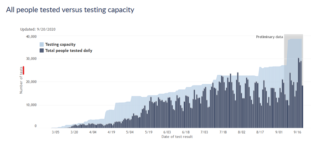
The second plot is for total number of tests, and compares this number to the state’s testing capacity. According to the site, “In this graph, people are included once for each time they are tested. If people tested positive or negative more than once, they are included and counted each time, on the date the testing lab reports their test result. Rarely, people may have multiple specimens, or swabs, collected at a single visit. Each of those specimens will use up some of our labs’ capacity. The total number of tests done may be greater than the number of people tested.”
These two plots give somewhat different impressions of the testing situation in the state. In terms of new people tested, we had a peak testing rate in mid-July, after which testing declined significantly, and it is only just now starting to get back to the mid-July level. I think this has generally been the narrative I’ve seen in the media, and it naturally raises questions. Why did testing decline in August? Why has testing capacity not improved since July so that we can better meet the current wave of cases?
The plot for total tests answers those questions, however. By this measure, testing did decline in August, but not by very much. And testing capacity is, in fact, considerably higher right now than it was in July. I think this shows that nothing is really going wrong in the state’s testing situation. Capacity has continued to increase gradually, though perhaps not as fast as we’d like, and now tests are rising to meet the surge in cases, though not fast enough to keep pace. This pattern is very similar to earlier phases of the pandemic.
The effect on positivity rate
The plots above also show that the total number of tests is about twice the number of new people tested, which tells us that about half of all tests are repeats on previously tested people. If the DHS used total tests as the denominator for its test positivity rate, intead of new people tested, the positivity rate would drop by a factor of 2 and the current situation might look a bit better. (To be clear, the positivity rate would still be relatively high and increasing, so I am not arguing that everything is fine if you only look at the data this way.)
The plot below shows these two positivity rates over time, cases per new people tested and cases per tests. It shows that as the pandemic has progressed, and more and more people have had at least one test, these two postivity rates diverged further and further. Early on, there was hardly any difference, but more recently the difference is large. Now unfortunately this data is a few weeks old, and I would love to see this plot continue for the most recent two weeks. Both rates have likely continued increasing.
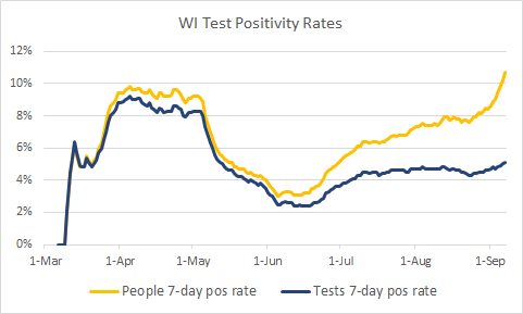
(Side note: the data is old because DHS does not give me a way to download the total tests, so to get the data I had to inspect their graphs manually point by point. I did this a few weeks ago when I had the idea for this analysis and don’t really want to do it again at the moment.)
New people tested vs. all tests - which is the right approach?
I think the DHS’s approach of reporting new people tested is at first confusing to a lay person like myself. But it does make sense - consider someone hospitalized with the virus and being tested every two days to clear her to go home. She would have a string of positive tests, but she only represents a single case of the virus. For the purposes of monitoring the virus prevalence in the state, it makes sense to only count her first positive test. Then, if that is how they treat the positive tests, it makes sense to be consistent and treat the negative tests the same way.
It seems to me, however, that for the purposes of monitoring prevalence of the virus, it would be more informative to count each negative test. Consider someone who had a fever in April, tested negative, and then had a sore throat in August and tested negative again. Shouldn’t those tests be counted independently? Or imagine a hospital worker tested every week for surveillance. Every week is a new chance to be infected; doesn’t every week’s test contain information that we should add to the data?
Or consider the extreme case under the new-people-tested convention. Once everyone in the state has been tested once, then only positive cases would be reported from then on…and the reported positive test rate would be 100%. The positivity rate would then clearly no longer be useful information!
So to me, it would seem to make sense to not report repeat positive tests, to avoid double-counting cases; but to indeed report repeat negatives as containing information on the status of testing and the prevalence of the virus.
The positivity rate by total tests does not quite meet this ideal, because the total tests denominator would include some repeat positives. But I believe it would be much closer than the positivity rate by new people tested, and I think it would more accurately reflect the state of the pandemic in Wisconsin.
Further information
I am certainly open to correction on this by professionals or others who have thought more about it. Other resources I have found on this issue include this blog post from the Covid Tracking Project and this Twitter thread from Jason Salemi, an actual epidemiologist who maintains a Florida Covid dashboard.